Get the latest news
Subscribe to receive updates from the School of Data Science.
The School of Data Science is committed to building a permanent collection of art and artifacts with the intention of housing them in a publicly-accessible database. The project is currently in process. If you would like to contribute or donate to the collection, please email datascience@virginia.edu.

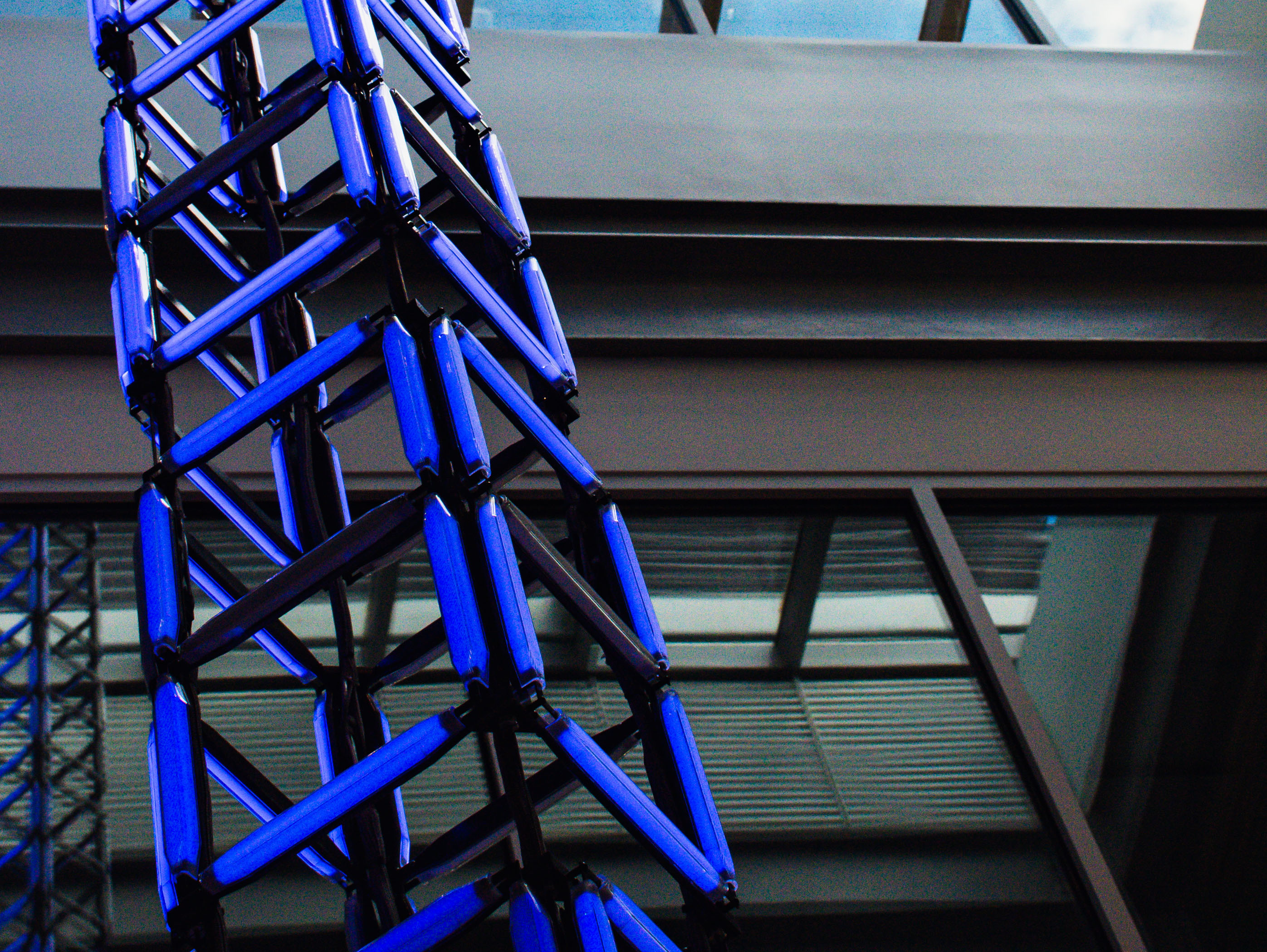
One of the most compelling features visitors will notice at the new home of the University of Virginia’s School of Data Science is its data sculpture, an interactive experience where anyone, whether a trained data scientist or not, can engage with data.
The sculpture hangs from a skylight and can be viewed from every floor and every angle of the central staircase.
The piece was designed as a column of 20 casements, with data flowing vertically through LED lights up the length of the approximately 40-foot-tall sculpture.
Visitors will be able to choose a data set from an interactive screen located on the building’s first floor and then view the story in a visually compelling way.
The initial preloaded data sets cover a wide range of issues, including the spread of COVID-19, the rise in global temperatures, and gun violence incidents.
Designed by SoSo Limited and built by Hypersonic, the sculpture aims to transform the atrium into an area where data is not just analyzed but also “felt and experienced,” according to Yaxuan Liu, the creative lead on the project for SoSo Limited.
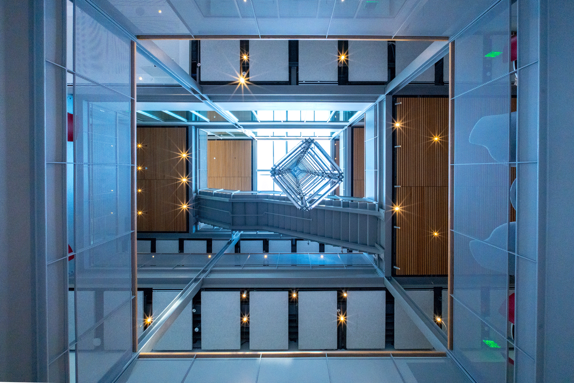
“This sculpture is more than just an art piece. It’s a living, breathing representation of the vibrancy and impact of data in our lives,” he said.
Bill Washabaugh, founder and lead designer at Hypersonic, explained how the design of the sculpture aims for a minimal presentation, with little refinement, allowing the data to tell the story.
“We’re sort of treating the sculpture, physically, the same way a scientist might treat their data,” he said.
He added that crafting the data sculpture and its unique design proved to be a challenging but rewarding experience.
“It’s playing a lot with materials, playing a lot with form, doing a long of computer modeling, and, ultimately, coming into the shop and putting things together,” Washabaugh explained. “And that’s what I really like to do.”
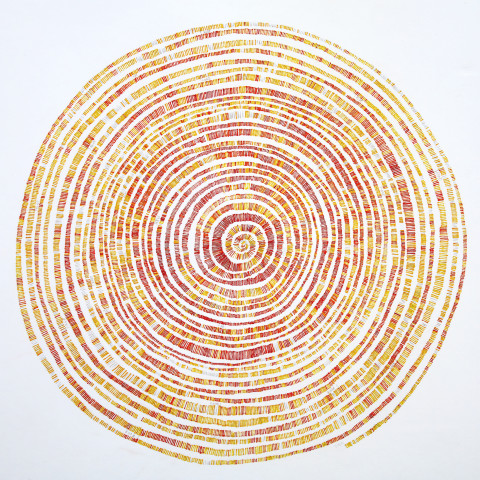
The spiral chart shows the Air Quality Index rating for the Los Angeles, California, urban basin, with each day represented by one tick, starting in the middle from Jan. 1, 1980 (the earliest date available for reliable data from the U.S. Environmental Protection Agency) and radiating out to Jan. 15, 2024. Each tick can be one of six colors: a rating of 50 or less (Good = graphite); 51-100 (Moderate = yellow); 101-150 (Unhealthy for Sensitive Groups = yellow-orange); 151-200 (Unhealthy = orange-red); 201-300 (Very Unhealthy = red); 301 or more (Hazardous = dark red).
Haske has been interested in environmental causes for many years, especially regarding steps that can be taken to help make conditions better, or at least reduce harm. Haske grew up in the Los Angeles area from birth to his early 30s (off and on) and remembers many Hazardous Air quality days in school when he and classmates were asked to stay indoors. Los Angeles and the surrounding area are regularly among the most polluted regions in the United States since data has been collected. Due to a pessimistic attitude, Haske initially expected this chart to show a worsening of conditions. However, he was pleasantly surprised to see a trend toward the cleaner for this specific metric. It shows that with concentrated effort we can effectively address a collective health issue.

Steve Haske grew up on the mean streets of Orange County, California, and then moved up the rough and tumble forests of Humboldt County, California, to receive a degree from Cal Poly Humboldt. He also attended The University of New Orleans where he met his wife and decided to stay for a while, eating good food, listening to great music, and filling lots of sketchbooks with drawings. Instead of doing odd jobs for the rest of his life, he moved to Savannah, Georgia, to get a master's degree in illustration from the Savannah College of Art and Design in 2005.
Haske worked for Nirve Sports in Southern California for seven years designing bikes — the kind you pedal to get around. They were mainly beach cruisers and city bikes, which he also enjoys pedaling around.
Since then, he has been designing, illustrating, painting, and using other creative approaches to describe and contribute to the beautiful world that is around us all. He has created editorial and commercial illustrations for clients such as WNRN Radio, Nest Realty, Virginia National Bank, Rivanna Medical, Pink Magazine, Ant Farm, and more. He has drawn and designed posters for such acts as Michael Kiwanuka, Steve Miller, Ben Harper, Lockn' Music Festival, Lake Street Dive, Lotus, Bela Fleck, and more.
Haske also taught art at Renaissance School in Charlottesville, Virginia, for six years. He can attest that young artists really are fantastic sources of inspiration and hope. That old cliche about teaching and learning being the same thing is true, he says.
Haske has exhibited artwork in various galleries, lobbies, side streets, and many personal collections.
Much of Haske’s work is focused on drawing images of architecture and mechanical structures and their complex interaction with nature. By contrasting and exploding expectations through drawing and collage, differences that can be at first jarring are made to be newly holistic.
Haske currently lives in Charlottesville with his family, where he continues to create in his home studio (https://www.stevehaske.com).
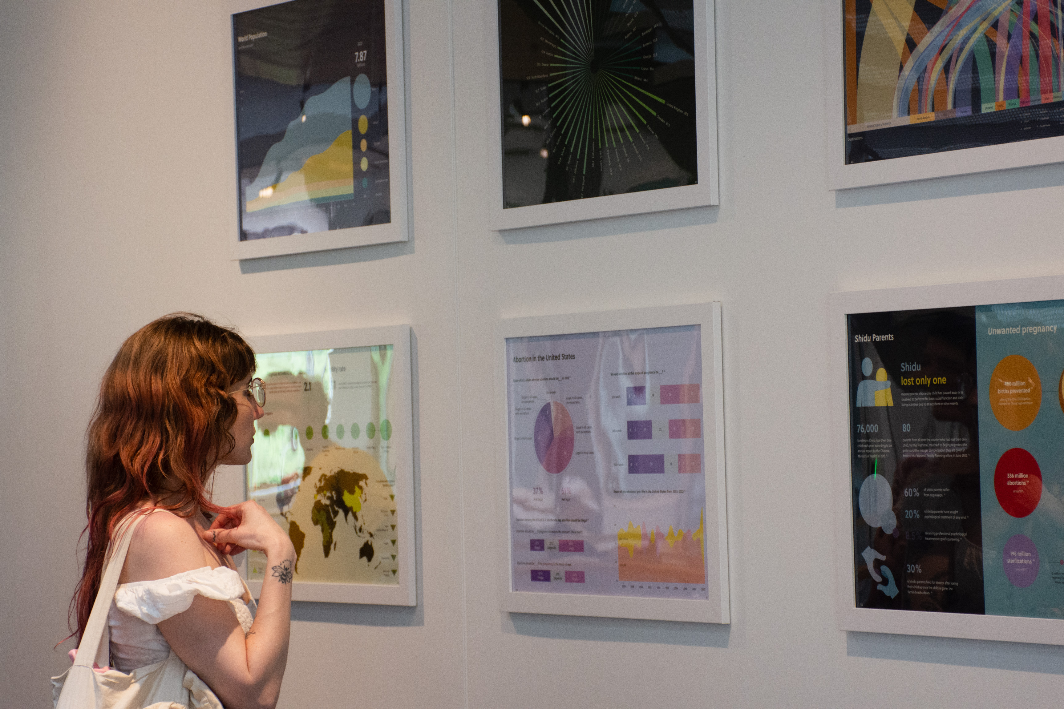
There once was significant anxiety around a growing world population, but now many are turning their attention to some of the short- and long-term impacts of a shrinking one, or at least one that is not growing quite as rapidly. To understand more about the change in the world population, the replacement level fertility concept is introduced to help estimate a stable population, without it increasing or decreasing. However, replacement fertility rate is crude, as it cannot be said that a woman should have a certain number of children in her life.
Many experts believe that the world population is in the fourth stage of the demographic transition model, where both birth and death rates are low and stable. It is now a question of whether the population will remain constant, meaning the fertility rate is the same as the replacement rate, or we will enter the fifth stage where the death rate exceeds the birth rate. The replacement rate is “the level of fertility at which a population exactly replaces itself from one generation to the next, requiring an average of 2.1 children per woman" (Craig 1994).
Why is the number 2.1 and not 2.0? The idea is that a woman needs to replace herself, which requires her to produce another girl to grow to be of reproductive age to continue the cycle. However, some are not concerned about decreasing birth rates and hesitate to acknowledge the future impact of extremely small birth rates. ''Counting Our Chickens Before They Hatch'' seeks to confront complicated issues of birth rates and to create simple and accessible information that helps the general public explore fertility rates and demographic changes through data visualization and visual narrative.
The work will start with an analysis of the current world population and bring attention to the four stages of the demographic transition model: pre-industrial, industrializing, mature industrial, and post-industrial. Then, it will zoom into the undeclared fifth stage of the model with the application of the replacement rate. The design process will continue with an analysis of how individual choice plays, or would play, into collective decision-making and conclude with a discussion on the impact of high and low birth rates in some countries.
Sources
Craig, J. (1994). Replacement level fertility and future population growth. Popul Trends.

Emma (Khai Hoan) Nguyen, originally from Ho Chi Minh City, Vietnam, and currently based in Boston, is a dedicated Masters of Fine Arts student at Northeastern University, specializing in information design and data visualization. With a passion for design, Nguyen has explored various mediums, ultimately finding her niche in data visualization and information design. Her work revolves around the power of storytelling, showcasing her ability to extract meaningful insights from complex data.
Subscribe to receive updates from the School of Data Science.