
Eight Finalists Selected for Inaugural Data Is ART Competition
The inaugural Data Is ART Competition at the University of Virginia's School of Data Science has announced eight finalists whose works will be displayed in the School’s new home set to open late April.
The finalists stood out among a competitive pool of participants for demonstrating a unique blend of creativity, innovation, and a deep understanding of the powerful intersection between data and art. There were more than 130 submissions to the competition from seven countries and four continents. The finalists include student submissions from Northeastern University and Parsons School of Design, a University of Virginia alumnus, a University of Virginia professor of music, and artists from as near as Charlottesville and as far away as Budapest, Hungary. Finalists are invited to attend the Award Ceremony and Presentation on May 8, 2024 which is open to the public and will also be streamed virtually.

Reef Generations
by Matthew Burtner
"Reef Generations" is a data artwork about oyster reef restoration on the Virginia eastern shore. Using data collected by University of Virginia environmental scientists working at the Virginia Coast Reserve (VCR), the piece synthesizes an audio-visual computer-generated environment that explores the marvelous underwater generation of oyster reefs and their function as a living seawall attenuating wave motion and storm surge from rising sea levels. Environmental data such as wave height, oyster count, and abiotic population growth are correlated in the algorithmic design, producing computer-generated animation and synthesized music. The piece also uses a stereo underwater field recording of the reef habitat, recorded by Burtner in collaboration with UVA’s Coastal Conservatory. This recording provides important clues about the health of the reef, and through spectral analysis the audio recording becomes a dynamic data set for resynthesis in the music and animation.

Nebulae
by Pete Cybriwsky
"Nebulae" is a real-time generative and data art installation designed specifically for Charlottesville’s environment, visualizing often overlooked or "nebulous" environmental changes. The piece is fed-in sensor data from The Device, which captures the area’s light, humidity, temperature, pressure, Air Quality Index (AQI), and carbon dioxide levels and feeds them into the live art piece. It features a current look at the environment as well as a comparative look at both the averages of the last 24 hours and since installation. The Device is placed on the roof of the building to best reflect the immediate environment of this building.


Stained Underwear
by Julia Daser and Pepi Ng
Ng and Daser visualize the labor, time, and resources that menstruating people have to invest into periods in their open-source kinetic installation, “Stained Underwear.” Drawing on their personal experiences, as well as their desire to shed light on the hidden and stigmatized inconveniences, Ng collected personal period data, recording the number of times they had to scrub their stained underwear in order to get the stains out during their irregular, 11-day-long menstruation. They also recorded the times of day when they cleaned each underwear. By drawing on Ng's personal period data, the project discusses menstruation from the most intimate point of view, bringing a topic that is usually hidden behind closed doors into a public space.

Glitch Hunt
by Ryan Gross
Google Earth gives us an incredible perspective of the textures and colors that cover the world's surface. But its system of mapping is far from perfect. Hidden errors and glitches are abundant, if you know where to look. Gross scanned the whole world over on Google Earth, collecting and categorizing glitches that don't exist in nature. In his thesis, Gross invites viewers into that process, as he projects some of the glitches onto a real satellite dish. The satellite acts as a bridge between the human perspective and the surveillant technological perspective. It highlights failure in a digital wilderness, failures that are ultimately very human.

LA AQI: 1980-2024
by Steve Haske
The spiral chart shows the Air Quality Index rating for the Los Angeles, California, urban basin, with each day represented by one tick, starting in the middle from Jan. 1, 1980 (the earliest date available for reliable data from the U.S. Environmental Protection Agency) and radiating out to Jan. 15, 2024. Each tick can be one of six colors: a rating of 50 or less (Good = graphite); 51-100 (Moderate = yellow); 101-150 (Unhealthy for Sensitive Groups = yellow-orange); 151-200 (Unhealthy = orange-red); 201-300 (Very Unhealthy = red); 301 or more (Hazardous = dark red). Haske has been interested in environmental causes for many years, especially regarding steps that can be taken to help make conditions better, or at least reduce harm. Haske initially expected this chart to show a worsening of conditions. However, he was pleasantly surprised to see a trend toward the cleaner for this specific metric. It shows that with concentrated effort we can effectively address a collective health issue.

Melody of Budapest
by Milán Janosov
The more we observe a city, the more apparent it becomes that it surpasses the sum of its parts. It resembles a colossal, intricate organism with its network of organs and unique internal dynamics. These dynamics are a tapestry woven from our daily interactions within the city: the bustling morning and evening rushes on the tram or subway lines, leisurely strolls along the riverbank — it all contributes to this vibrant tapestry. Though it sounds idyllic, it stands worlds apart from the vast data streams of corporations, the omnipresent data visualization tools, the ongoing buzz about artificial intelligence across various platforms, or even the fundamental essence of artistic expression — music. "Melody of Budapest," sponsored by Telekom Hungary, aims to bridge these divides by transforming the city's dynamic mobility patterns into a musical piece using data science and AI.
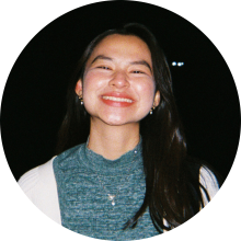
Counting the Chickens Before They Hatch
by Emma (Khai Hoan) Nguyen
''Counting Our Chickens Before They Hatch'' seeks to confront complicated issues of birth rates and to create simple and accessible information that helps the general public explore fertility rates and demographic changes through data visualization and visual narrative. The work will start with an analysis of the current world population and bring attention to the four stages of the demographic transition model: pre-industrial, industrializing, mature industrial, and post-industrial. Then, it will zoom into the undeclared fifth stage of the model with the application of the replacement rate. The design process will continue with an analysis of how individual choice plays, or would play, into collective decision-making and conclude with a discussion on the impact of high and low birth rates in some countries.

A Perfect Storm
by Chloe Prock
In the face of pressing global issues like climate change, data visualization is a powerful tool for making sense of complexity. Drawing from diverse readings on climate change and capitalism, the project “A Perfect Storm” initially aimed to highlight the dichotomy between countries least responsible for climate change, yet most at risk. However, during the process of gathering and visualizing data, Prock and colleagues found that there was much more nuance to this story. This process highlights the importance of critical reflection of data and the context in which it is situated. The project combined datasets on greenhouse gas emissions from Our World in Data and the Climate Risk Index from Germanwatch to explore the relationship between a country’s contributions to climate change and its experience of climate-related natural disasters.