Data Visualization Showcase Lets Student Creativity Shine
Each year, Eric Field chooses a one-word theme for his data visualization course.
“It's usually based upon something going on in the world at the time,” said Field, who is director of information technology at the School of Architecture and holds a courtesy appointment with the School of Data Science.
Last year the word was "tolerance." The year before, "viral." (While some students that year investigated COVID-19, others were more liberal in their interpretations, looking at “things that go viral or things that spread quickly,” Field noted.)
In every case, "I try to pick something that has a tension built into it, because I want to set up this idea of ‘No, these are not just done problems,” he said.
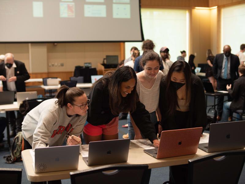
This year the word was fragile, and last week, Field’s full class of 90 students from across the University of Virginia gathered in the Hunter Smith Band Building to present their interpretations at the course’s final showcase.
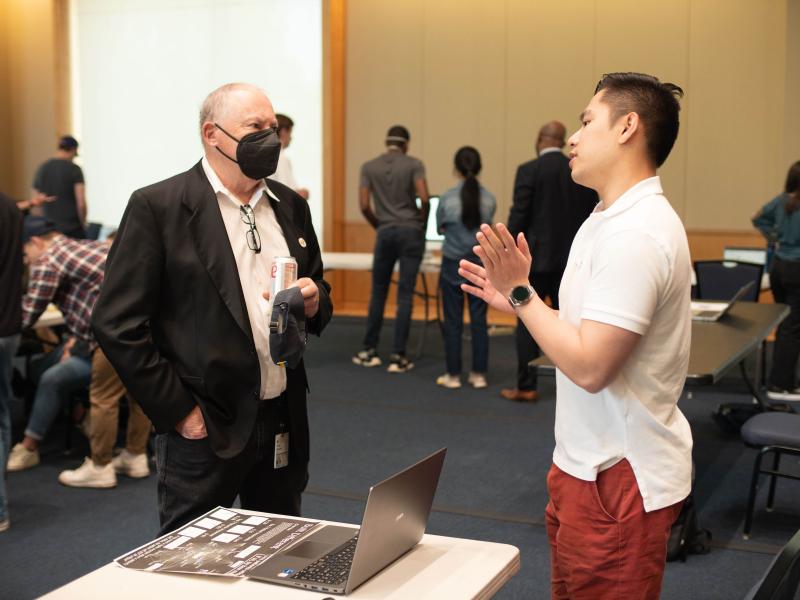
In an arrangement that Field likened to the final review in architecture classes, students set up their laptops to form a digital, interactive gallery displaying their final projects. Other students and staff wandered through, asking questions and offering feedback.
Democracy, food deserts, the Russian invasion of Ukraine, crumbling bridge infrastructure — students found a range of creative ways to explore, and visualize, fragility. “They've taken so many different angles on it, which is great,” Field remarked.
The term “data visualization” might bring familiar pie charts and bar graphs to mind, but Field pushes his students to think more dynamically.
“I asked them to take some risks with this,” he said. “Try something you haven't tried before. Don't just fall back on the things that you already know.”
We spoke with three data science master’s students about their projects, their takeaways from the course, and how they used data to visually evoke the fragility of our world.
Fatalities from Cholera
Beza Delelegn (MSDS ’22)
How does your project relate to the word “fragile”?
Cholera is preventable with a simple oral rehydration solution, yet so many people are still dying. It's actually the seventh pandemic of cholera — the current one started in 1961. Of course, there's been improvement, but I think [the situation] is fragile because cholera is preventable and yet people are still suffering from it, especially in certain regions.
What questions did your project ask?
My two-part question is basically how are cholera transmissions occurring and why are they occurring? I looked at the patterns of transmission, seeing how they vary by region for the cholera fatality rate. But [in my interactive visualization] I also included a merged dataset that has indexes like open defecation, basic sanitation services, drinking water services, and hand washing facilities. The idea is that there is correlation between those and the cholera rates.
What did you appreciate most about this course?
Every time I went to Professor Field’s office hours, I changed my project a little bit, but in the best way possible. He kept pushing me and pushing me to get to a more refined idea. A lot of the time, we just stick to our first or second idea, and we don't do that refining process. But this class encouraged me to do it, particularly because we had multiple peer reviews and other processes where we could get feedback on our work.
Climate Change
Madeline Hennessy (MSDS ’22)
What patterns does your visualization reveal?
I looked at temperature anomalies as they increased from 1880 to 2021, and you can see that as the world has gotten hotter, natural disasters like wildfires, droughts, and floods have gotten more sporadic, which is an indicator of climate change. And then you also have environmental factors like freshwater use, population, and CO2 emissions that are increasing and adding pressure to the temperature anomalies.
Why did you choose to focus on climate change?
There is so much we need to do to mitigate the impacts of climate change, but people don't integrate these changes into their lifestyle because it feels like a faraway issue. While climate change is impacting us on a global level, as shown in my static visualization, it is also impacting us on a more individual level, which I show in my interactive visualization. [Individual] countries are feeling the pressures of climate change — experiencing increased natural disasters, negative economic change, and mass migration. By increasing the fragility of countries, climate change is creating a more fragile world.
What did you learn from this course?
This class helped me understand that there are so many ways to visualize data. Visualizations are important in revealing patterns and trends, and this class taught me how to do that in a way that's easy for the viewer to understand.
Rainforest Degradation
Felipe Barraza (MSDS ’22)
Why did you choose to visualize rainforest degradation?
I wanted to work with something related to my home continent of Latin America, and because the theme was fragility, I thought it would be fitting to look at deforestation in the Amazon rainforest. I randomly stumbled upon my dataset when looking for what to do, and when I saw all the data it contained, I knew it was the one.
What were you looking to explore with your project?
I wanted to see if there was a relationship between the area lost in the rainforest and the fire outbreaks that happened there. I started by plotting data from a period of 20 years on a map to see if the fires had a general spread over time, and I found that during the winter and early spring, [which are drier seasons in Brazil,] larger quantities of fire outbreaks happened in the civilized regions, while the regions that were more jungly had more fire outbreaks in the summer months. This aligns with the idea that in the densely jungled areas, it's due to natural events like lightning, and then in the drier seasons, it's due to humans.
What did you take away from this class?
For me, the biggest takeaway was to just try things. Professor Field always encouraged us to do that and not to expect perfection. It liberated me to just explore — no fear of doing things wrong or worrying if my grade would suffer. I really liked that Professor Field created a space for us to be freely creative, which is something you don't often get in college or life!