Applying Racial Equity Awareness in Data Visualization
The UVA Data Science Symposium hosted a lecture by Jonathan Schwabish on “Applying Racial Equity Awareness in Data Visualization.” The Symposium features experts on a variety of data science-related topics and is a new series offered by the University of Virginia’s School of Data Science. Schwabish explored the question, “How can analysts, researchers, and developers apply a race- and ethnicity-conscious lens to their data analysis and data visualization work?”
Jonathan Schwabish is an economist, writer, and teacher. In addition to being a Senior Fellow at a nonprofit research institution in Washington, D.C., he is the founder of PolicyViz, a data visualization and presentations skills firm. He is considered a leading voice for clarity and accessibility in how researchers communicate their findings. In this lecture, Schwabish explored four ways analysts, researchers, and developers can take an equity-centered approach to their analysis including language, ordering, missing groups, and color.
Beginning with language, Schwabish used the example of the word “Latinx.” While the word was first popularized in the 2010s, a Democratic party polling shows people of Hispanic and Latino heritage not only prefer a different descriptor, but 40% of those surveyed said the term offended them. Schwabish explained that to represent populations equitably and consciously, it is important to allow them to define their own identity.
Schwabish said, “People are more likely to engage and use our work in our visualizations when they see themselves. We want to do that in a respectful, equitable, and inclusive way."
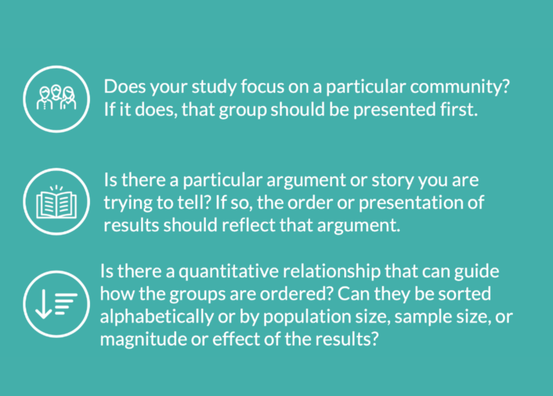
He then presented issues related to ordering. He asked the audience, “Why is race often ordered the same way: white, Black, American Indian, Alaskan Native, and Asian Pacific Islander?” Schwabish challenged the audience to inquire why white is the default and placed in the first position, and offered the following questions to be considered when creating your order in data visualizations:
Third, Schwabish explored missing groups, explaining how they differ from missing data. “You go into your data set and a bunch of people didn’t answer the question on income, housing, or whatever it is.” He pointed out that missing data are different from missing groups. “I’m thinking here about missing people... the people or the communities or groups who are not represented in the underlying survey itself.”
Schwabish used the gender binary as an example. He said, “We know that gender is not binary, but in every survey, I just showed you, and in many more, the questions about gender are always binary.” Schwabish argues that when gender is only surveyed through the binary, groups are missing and data areleft out.
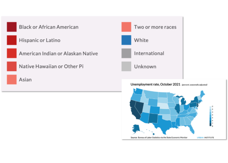
Finally, Schwabish connected color to equitable practices, arguing color has implications in data visualization and can prioritize color-assigned groups over others. He gave the example of a Tableau dashboard that uses shades of red for all races except for white.
Schwabish stressed that analysts, researchers, and developers have a responsibility to equity and not just because it is the right thing to do.
“We need to [start recognizing] these different experiences and to take that idea of empathy throughout the entire ecosystems and workflow.”
View his presentation to learn more. Passcode:nZxcX+D9
The Data Science Symposium is spearheaded by Associate Dean of Faculty & Academic Affairs Jeffrey Blume and is sponsored by the School of Data Science at the University of Virginia. For the inaugural year, bi-weekly lectures are planned in person with a virtual attendance option. If you would like to learn more about presenting or attending, please reach out to datascience@virginia.edu.